
Elmedical Background
Elmedical Beauty Salon is a clinical–beauty center offering skincare, facial treatments, cosmetic services, permanent makeup, microblading, and tattoo removal. The brand combines a feminine, soft, yet medical personality, appealing to women aged 50-20 who seek premium beauty solutions. Elmedical’s mission is to help clients stay young, beautiful, and confident through expert, science-based care.

Challenges & Goals
The main challenge was to create a logo that combines feminine style, a woman’s face, and a lotus flower in a way that feels calm, trustworthy, and elegant; without becoming overly decorative or cliché.
The brand needed an identity that would stand out among local competitors while clearly reflecting its clinical–beauty approach.
The visual direction focused on three priorities: feminine energy, soft calmness, and professional trust.
Concept Development
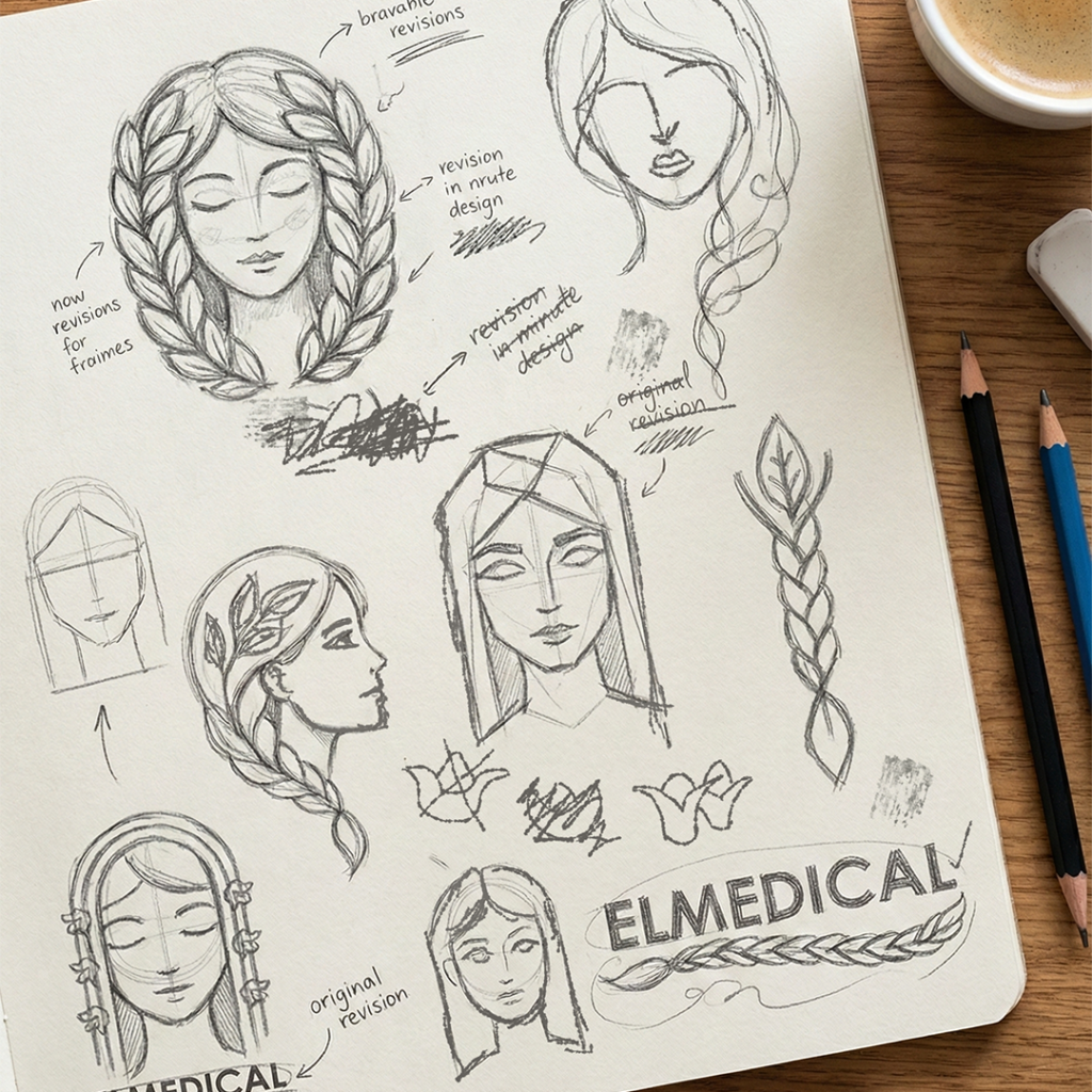
The design process began with sketches exploring different ways to combine a female face with a lotus flower, aiming for a mark that feels both emotional and clinically refined. Several variations were tested—ranging from soft line-art to more abstract compositions—to find the right balance between femininity, calmness, and precision.
The final direction emerged from the idea that the lotus and the female face together symbolize the emotional beauty aspect of the salon, while also supporting its clinical and professional character.
Before arriving at the final symbol, multiple alternative concepts were explored to refine proportions, visual flow, and overall clarity.


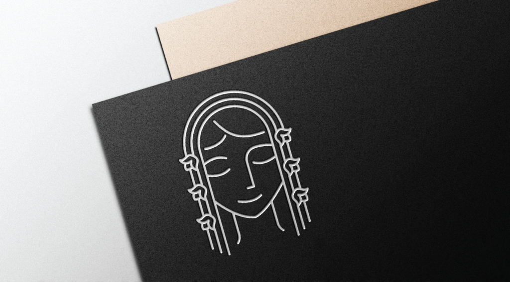
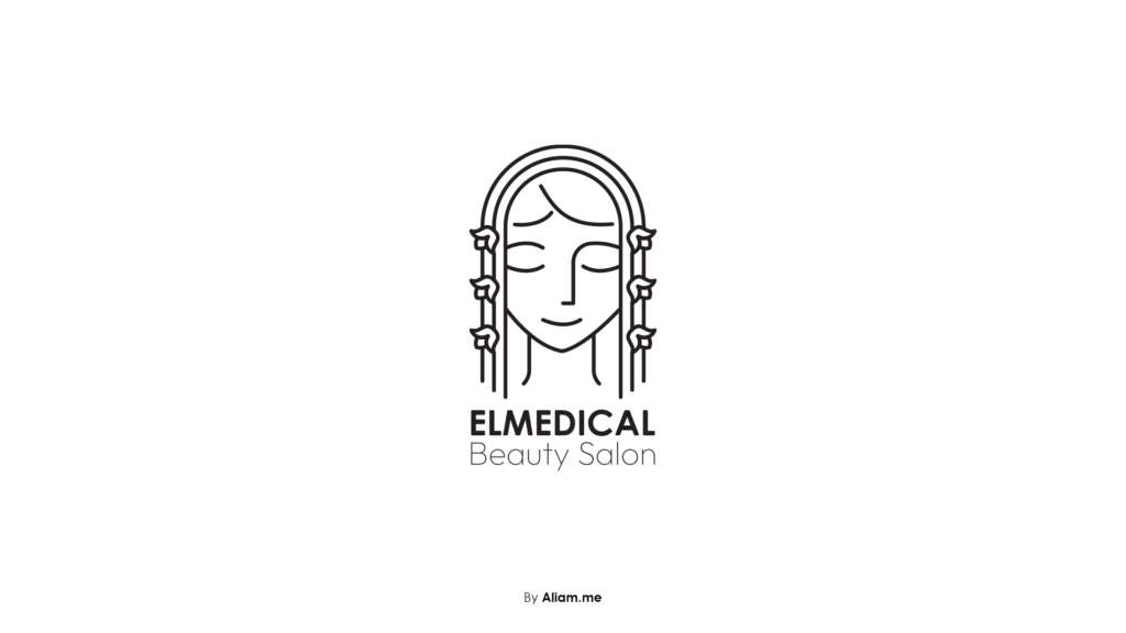
Final Logo & Identity
The final logo is built around minimal line-art with a feminine, elegant character, reflecting both the emotional and clinical nature of the brand. Soft curves and balanced shapes create a calm, premium feel while maintaining clarity at any size.
The visual identity includes the primary logo, a soft & feminine color palette, and carefully selected typography that supports the brand’s modern, delicate tone.
The identity works consistently across light and dark backgrounds, ensuring flexibility for digital and print applications.
Full case study on Behance.
More projects on Dribbble.